A Practical Cheat Sheet for CSS Flexbox (Containers)
Published on Tuesday, July 27, 2021
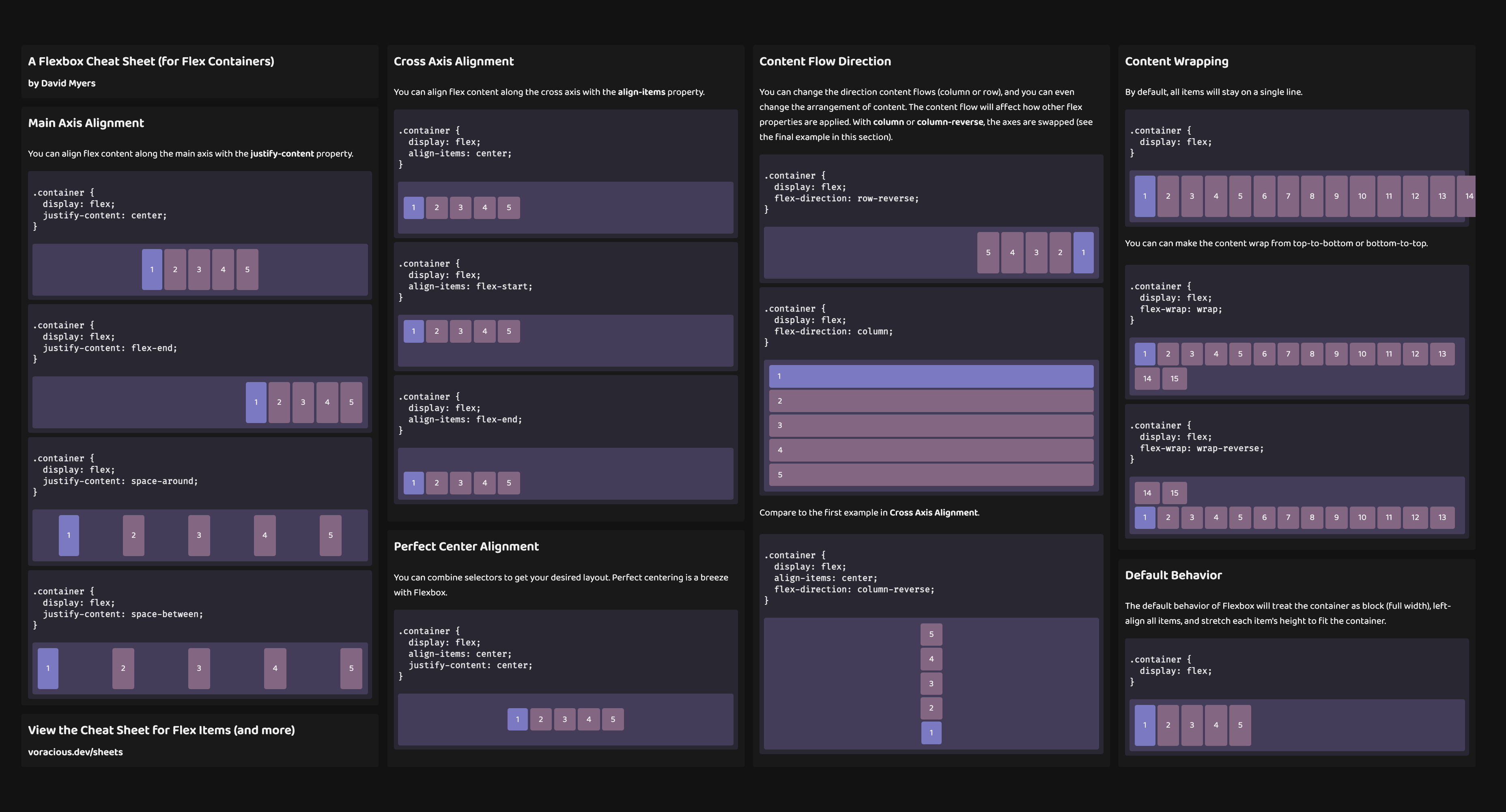
In this guide, you will learn how to use CSS Flexbox to manage some common layout patterns.
I originally posted this Flexbox cheat sheet on Twitter, but the response was so positive that I decided to write it up here too! I've made a few updates since the original, and it's become a great resource to share with colleagues.
Default Behavior
The default behavior of Flexbox will...
- Treat the container as block (full width)
- Left align all items
- Stretch each item's height to fit the container
- Fit all items on a single line
.container { display: flex;}Main Axis Alignment
You can align flex content along the main axis with the justify-content property. In typical layouts, this will be horizontal alignment.
Anchor content to the center of the main axis
.container { display: flex; justify-content: center;}Anchor content to the end of the main axis
.container { display: flex; justify-content: flex-end;}Add space around content along the main axis
.container { display: flex; justify-content: space-around;}Add space between content along the main axis
.container { display: flex; justify-content: space-between;}Cross Axis Alignment
You can align flex content along the cross axis with the align-items property. In typical layouts, this will be vertical alignment.
Anchor content to the center of the cross axis
.container { display: flex; align-items: center;}Anchor content to the start of the cross axis
.container { display: flex; align-items: flex-start;}Anchor content to the end of the cross axis
.container { display: flex; align-items: flex-end;}Perfect Center Alignment (vertical and horizontal)
You can combine selectors to get your desired layout. Perfect centering is a breeze with Flexbox.
.container { display: flex; align-items: center; justify-content: center;}Content Flow Direction
You can change the direction content flows (column or row), and you can even change the arrangement of content. The content flow will affect how other flex properties are applied. With column or column-reverse, the axes are swapped (see the final example in this section).
Reverse the flow of content along the main axis (horizontal reversed)
.container { display: flex; flex-direction: row-reverse;}Flow content along the opposite axis (vertical)
.container { display: flex; flex-direction: column;}Reverse the flow of content along the opposite axis (vertical reversed)
As an added bonus, we'll also center the content along the new main axis. Compare this to the first example in Cross Axis Alignment above.
.container { display: flex; align-items: center; flex-direction: column-reverse;}Content Wrapping
By default, all items will stay on a single line regardless of overflow.
Note: These examples have been set to overflow: scroll to prevent the page from being distorted.
.container { display: flex;}Wrap content to next lines (flow down)
.container { display: flex; flex-wrap: wrap;}Wrap content to previous lines (flow up)
.container { display: flex; flex-wrap: wrap-reverse;}Closing
Thanks for taking the time to check this out! I'd love to hear about how you're using Flexbox, so feel free to leave a comment below or reach out on Twitter or on GitHub! ✌️